I have had people ask me about various tools when I teach classes or deliver lectures/seminars that I thought I’d share some of those through my blog along with any tips I think of along the way. Enjoy!
Once you get past your basic pedigree or family group sheet, and especially when working on DNA projects, genealogists find themselves wanting to make a chart that is more complicated and/or more customizable than most genealogy software offers. I have used simple text and boxes in Mac Pages (same can be done in Word), Keynote (same can be done in Powerpoint), and various drawing programs. A friend introduced me to LucidChart and I’ve never looked back! (NOTE: This is NOT an affiliate link or anything. I do NOT get any kind of compensation for sharing this information.)
Lucidchart is very easy to use, intuitive, versatile, and did I say easy? The workspace is very intuitive.
You can easily add shapes, put text into those shapes, fill the shapes with color, connect the shapes with lines, put text onto the lines, and so much more. There are options for what file type to download your chart as, sharing with others, creating slides for a presentation, and many other fancy options.
I won’t go into the details of how to do everything. There are many resources for learning more about Lucidchart. They have an excellent help section on the website and they have a YouTube channel that features helpful tutorials and some funny videos that demonstrate Lucidchart features.
In genealogy, we run into “pedigree collapse” quite frequently. Pedigree collapse happens when cousins marry cousins such that on two (or more) branches of your family tree you find the same ancestral couple. For example, my parents are fourth cousins. Back in the tree the Meeker family lived next door to the Avery family, and four Avery siblings married four Meeker siblings. So two ancestral couples are actually the same ancestral couple, I have Mahlon Meeker and Frances Cooper on both my mother’s side and my father’s side.
Sometimes this sort of thing gets much more complicated. I am currently working on a project to figure out how the Higdons and the Renfros (and the Renfros) are related. Take a look:
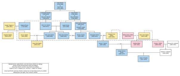
Now, I know you probably can’t read that text. The point is not to help me with my research project (though if you have Higdons or Renfros in Missouri and Kentucky please email me), but to show you how complicated a chart can get and how easy it is to demonstrate it with Lucidchart. (The yellow boxes are Higdons, the blue are Renfros, and the pink are Willetts. Several Higdons married the Renfro cousins and several Renfros married their Renfro cousins.) And I also know genealogists and you probably REALLY want to see that text. You can see this chart on Lucidchart here.
I use Lucidchart nearly everyday when I’m working on projects for my personal work and for clients. I don’t know what I’d do without it. There is a free level and a subscription level as well. I did very well with the free level for quite some time.
Lucidchart is not the only charting game in town. You might have a tool you prefer. But if you have been struggling with charting, you might give Lucidchart a try. I highly recommend it.

Thank you for sharing this information. I can’t wait to start using it.
Great charts! I love it too. It’s such an intuitive tool.