Since we work from the known to the unknown, I had already researched the Long family line from myself back to William Long. In William’s records, he overwhelmingly reports that he was born in Ireland in about 1819. (If George Long arrived in Ohio in 1817, then William was born in Ohio, or George did not arrive in 1817 but later, or, William arrived later as a young child and was born in Ireland, but then George would have been married in Ireland, not Ohio… You see how this goes?)
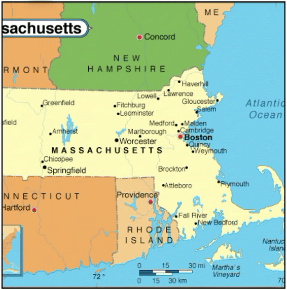
Anyhoo, William married Sarah Metzger on 15 April 1841 in Stark County, Ohio. In 1850, William and his family lived in Allen Township, Hancock County, where he worked as a wagon maker. By 1860, William was farming in Findlay Township to the south of Allen Township. William was killed at Stout’s gristmill at Gilboa, Putnam County, on 13 August 1861, when his clothing got caught up in the belts, and he was dragged into the machinery; his body was horribly mangled.
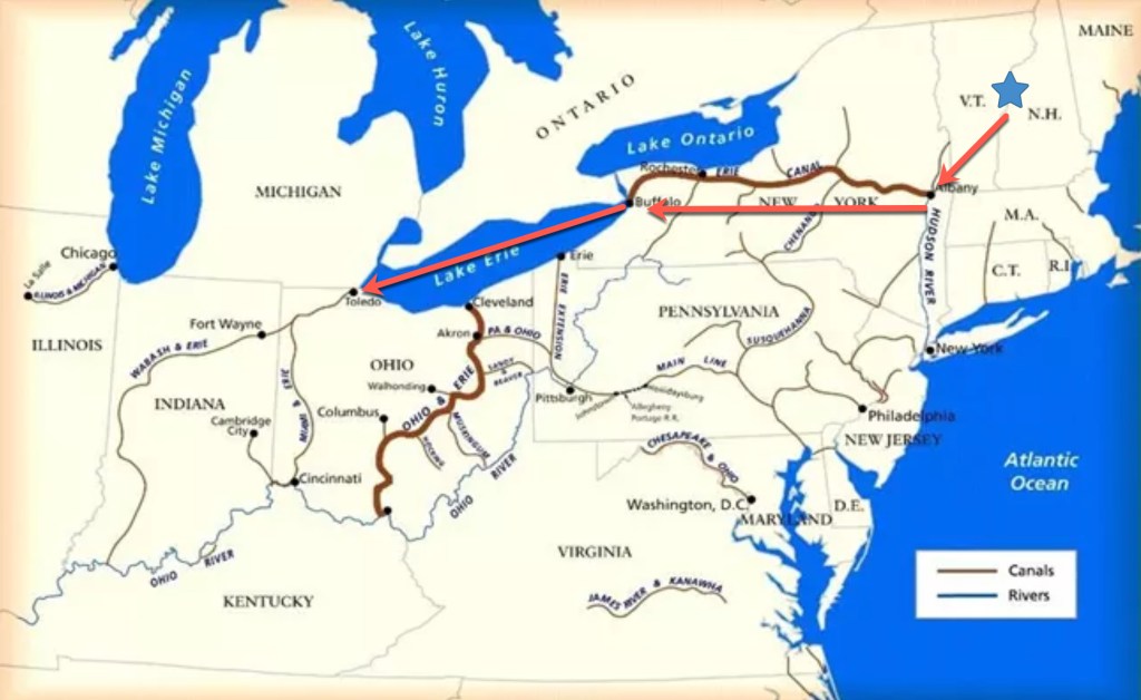
Knowing the information about William pins him in a time and place. I then looked for George Long in Hancock County, as mentioned in J. W.’s biographical sketch, the family relocated to Hancock County. Two George Longs lived in Hancock County at the right time and were of similar ages.
- George W. Long lived in Amanda Township in Hancock County in 1840. A land patent refers to him as George Long “of Franklin County.” Franklin County is not one of the five counties that made up Carroll, and it is located in central Ohio, several counties to the south and west of the counties in question. George of Amanda Township was reportedly born in Maryland. He died on 18 August 1880 and was buried in Salem Cemetery in Houcktown, Jackson Township, Hancock County.
- George Long lived in Portage Township in Hancock County in 1850. He purchased 40 acres from William R. Alexander in Portage Township, Hancock County, in 1848. He died in Hancock County on 8 October 1855 and is buried next to his wife, “Isabel,” at Thomas Cemetery.
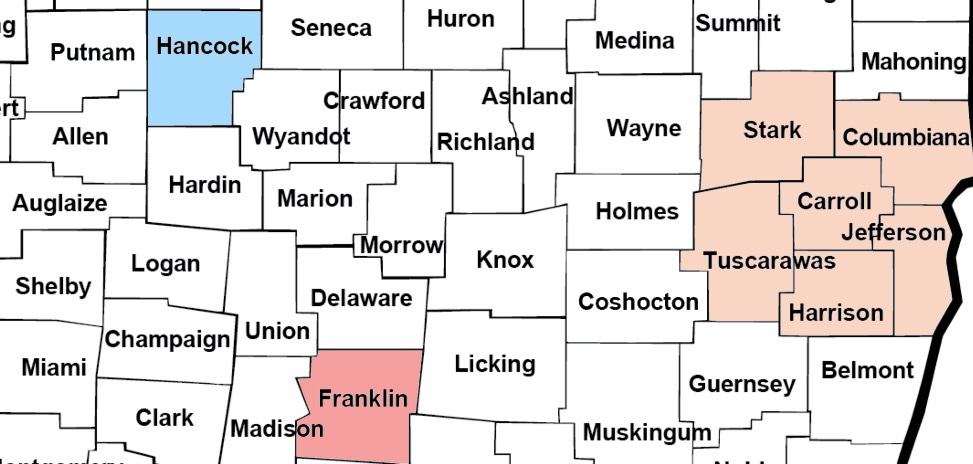
So, two candidates in Hancock County exist. I need to determine which one is the father of William before I can then identify which George of the twelve is the correct George. The answer next time…